This article was originally published on jdkaplan.com and is republished here with permission.
Regardless of discipline, many fields need to be able to process, manipulate, and visualize data. This article introduces the basics of plotting data with Python using Matplotlib. View the notebook on Github or experiment with it yourself on Google Colab.
Prerequisites
You must have Python with Matplotlib and NumPy installed to follow along with this on your own (Google Colab does this for you). If you want to set this up on your own machine, I recommend using the Anaconda Python distribution.
Initial Setup
We'll begin with the line %matplotlib inline. This is specific to notebooks
and tells the notebook to render matplotlib plots inline. We then import
the libraries we'll use throughout our examples. In this case, numpy and matplotlib.pyplot.
%matplotlib inline
import numpy as np
import matplotlib.pyplot as plt
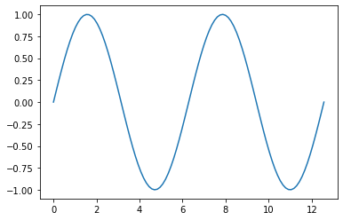
A Simple Plot
Our first plot is a simple sine plot using np.sin. First we use np.linspace to
create a list (or NumPy array in this case) of all our X points. In this case, an evenly spaced list from
to with 100 points. We then generate our Y points by calling np.sin on
the X list. Finally, we can use plt.plot(x, y) to plot the results.
x = np.linspace(0, 4*np.pi, 100)
y = np.sin(x)

plt.plot(x, y)
plt.show()
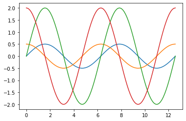
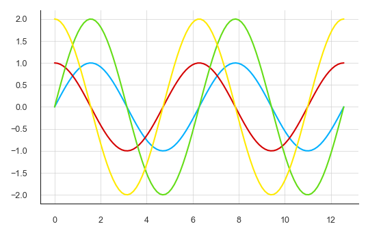
Multiple Lines
Now we'll plot multiple lines on a single chart. In this case,
- .
We have the option of calling plt.plot once as plt.plot(x, y1, x, y2, x, y3, x, y4)
or once for each plot (shown below).
x = np.linspace(0, 4*np.pi, 100)
y1 = 0.5*np.sin(x)
y2 = 0.5*np.cos(x)
y3 = 2*np.sin(x)
y4 = 2*np.cos(x)

plt.plot(x, y1)
plt.plot(x, y2)
plt.plot(x, y3)
plt.plot(x, y4)
plt.show()
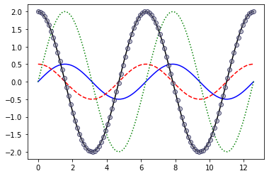
Line Styles
We can pass additional arguments to plot() to specify the line style. The
first way to provide a format string. That might look something like '-b'
or '--sy'. We can specify the line style, marker style, and color with this
format string. For example - tells matplotlib to make the line solid, -- is
dashed, and : is dotted. We can also define the marker style. In our '--sy'
example, s declares that the marker should be square. The full list of marker
codes can be found here.
Finally, we can specify the color. The following color codes are available:
bis blueris redgis greencis cyanmis magentayis yellowkis black
If we want to customize our plot styles further, we can use a variety of keyword
arguments such as markersize and linewidth to modify the plot style. The
full list of options is available here.
# Solid, blue line
plt.plot(x, y1, '-b')

# Red, dashed line
plt.plot(x, y2, '--r')

# Dotted, green line
plt.plot(x, y3, ':g', linewidth=1.5)

# We call also use keyword arguments
plt.plot(
    x, y4, '-ok',
    markersize=6,
    markeredgewidth=0.75,
    markeredgecolor=[0.1, 0.1, 0.3, 0.9],
    markerfacecolor=[0.5, 0.5, 0.6, 0.5]
)
plt.show()
Using Stylesheets
If we want to change a lot more about our plot with a lot less code, we can use
stylesheets. Matplotlib comes with several predefined stylesheets. We can use
plt.style.available to see the list of available style sheets.
print(plt.style.available)
['Solarize_Light2', '_classic_test_patch', 'bmh', 'classic', 'dark_background', 'fast', 'fivethirtyeight', 'ggplot', 'grayscale', 'seaborn', 'seaborn-bright', 'seaborn-colorblind', 'seaborn-dark', 'seaborn-dark-palette', 'seaborn-darkgrid', 'seaborn-deep', 'seaborn-muted', 'seaborn-notebook', 'seaborn-paper', 'seaborn-pastel', 'seaborn-poster', 'seaborn-talk', 'seaborn-ticks', 'seaborn-white', 'seaborn-whitegrid', 'tableau-colorblind10']
In this case, we'll combine a few style sheets that set the plot size, grid colors, and line colors to create a graph with a clean style without having to specify the style of each line.
plt.style.use('seaborn-talk')
plt.style.use('seaborn-whitegrid')
plt.style.use('seaborn-deep')

x = np.linspace(0, 4*np.pi, 100)
y1 = np.sin(x)
y2 = np.cos(x)
y3 = 2*np.sin(x)
y4 = 2*np.cos(x)

plt.plot(x, y1, x, y2, x, y3, x, y4)
plt.show()
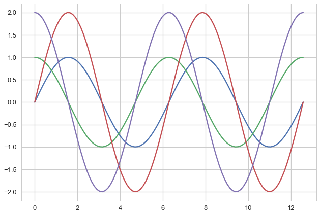
We can also create our own style sheet. The one for this example can be found on GitHub. This stylesheet defines the plot size, custom colors, and a bit more.
plt.style.use('mystyle.mplstyle')
plt.plot(x, y1, x, y2, x, y3, x, y4)
plt.show()
Scatter Plots
Now we can use plt.scatter to plot some noisy data. According to
Jake VanderPlas,
plt.plot is much more efficient than plt.scatter for larger data sets.
x = np.linspace(0, 8, 100)
y = 2*x

# Add noise
noisy = [point + 5*np.random.random() - 5*np.random.random() for point in y]

plt.scatter(x, noisy, marker='o', s=2)
plt.show()

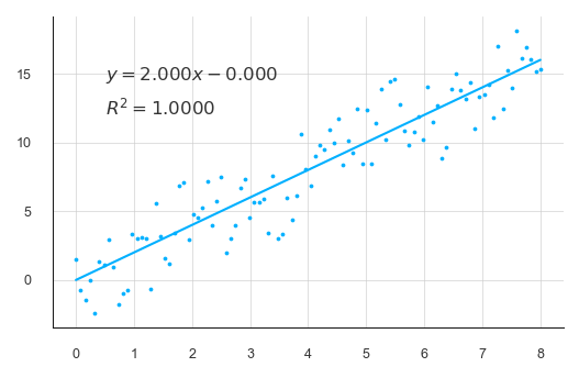
Best Fit Line
Now we can use NumPy's polyfit to generate a polynomial fit line. We'll also add some text to the plot to show the equation of the line and the R-squared value.
# Fit line
degree = 1
fit = np.polyfit(x, y, degree)
bfline = fit[0]*x + fit[1]

# R-squared
correlation_matrix = np.corrcoef(x, y)
correlation_xy = correlation_matrix[0,1]
r_squared = correlation_xy**2

# R-squared
p = np.poly1d(fit)
yhat = p(x)
ybar = np.sum(y)/len(y)
ssreg = np.sum((yhat-ybar)**2)
sstot = np.sum((y - ybar)**2)
r_squared = ssreg / sstot

# Plot data points and line fit
plt.scatter(x, noisy, marker='o', s=2)
plt.plot(x, bfline)

# Generate labels and show plot
m = f'{fit[0]:.3f}'
b = f'{fit[1]:.3f}'
op = '' if b.startswith('-') else '+'
eq_label = f'$y = {m}x {op} {b}$'
r_label = f'$R^2 = {r_squared:.4f}$'
plt.text(0.5, 14.5, eq_label, fontsize=8)
plt.text(0.5, 12, r_label, fontsize=8)
plt.show()
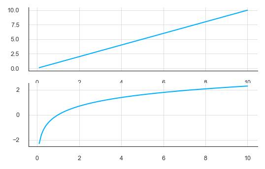
Subplots
We can also generate and plot multiple graphs in a single figure using subplots.
The simplest way to do this is call plt.subplot(). Subplot takes three
arguments: the number of rows, the number of columns, and the position of the
next plot.
x = np.linspace(0.1, 10, 100)

plt.subplot(2,1,1)
plt.plot(x, x)

plt.subplot(2,1,2)
plt.plot(x, np.log(x))

plt.show()
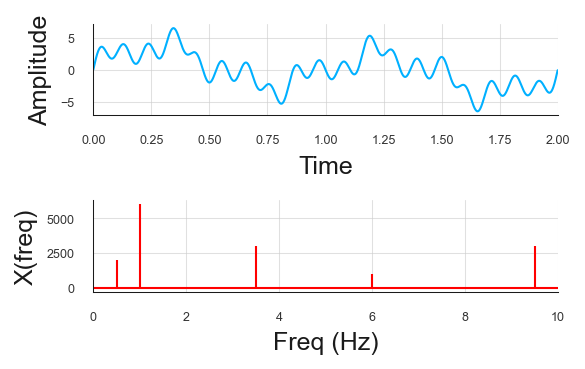
FFT Example
Let's look at another example using a Fast-Fourier Transform (FFT). This example is based on this page from UC Berkeley. First we need to generate an aggregate signal. In this case, our signal consists of three sine waves of varying frequencies and amplitudes.
# Complex signal
sr = 2000 # sampling rate
ts = 1.0/sr # sampling interval
t = np.arange(0,2,ts)

freq = 1
A = 3
x = A*np.sin(2*np.pi*freq*t)

freq = 3.5
A = 1.5
x += A*np.sin(2*np.pi*freq*t)

freq = 6
A = 0.5
x += A* np.sin(2*np.pi*freq*t)

freq = 9.5
A = 1.5
x += A* np.sin(2*np.pi*freq*t)

freq = 0.5
A = 1
x += A* np.sin(2*np.pi*freq*t)
Then, we can compute the fast-fourier transform (FFT) of the plot using NumPy's fft module.
X = np.fft.fft(x)
N = len(X)
n = np.arange(N)
T = N/sr
freq = n/T
F = np.abs(X)
print(F)
[3.12747923e-14 2.00000000e+03 6.00000000e+03 ... 2.35140134e-13
 6.00000000e+03 2.00000000e+03]
Then we will create a figure with subplots (2 rows and 1 column) and plot the time series signal on the top set of axes and the frequency domain on the bottom.
fig, axs = plt.subplots(2, 1)

axs[0].plot(t, x)
axs[0].set_xlim(0, 2)
axs[0].set_xlabel('Time')
axs[0].set_ylabel('Amplitude')
axs[0].grid(True)

axs[1].stem(freq, F, 'r', markerfmt=" ", basefmt="-r")
axs[1].set_xlim(0, 10)
axs[1].set_xlabel('Freq (Hz)')
axs[1].set_ylabel('X(freq)')
axs[1].grid(True)

plt.tight_layout()
plt.show()
Formatting
With some basics of plotting covered, its worth introducing some formatting basics to make your plots a bit more professional and detailed.
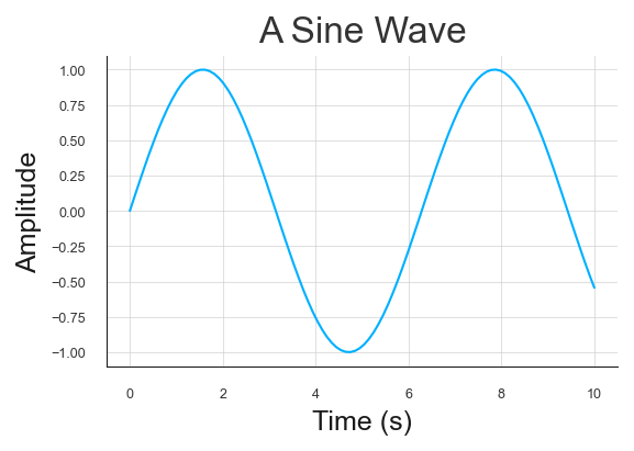
Titles and Axes Labels
Matplotlib provides .title(), .xlabel(), and .ylabel() functions to add
plot titles and axes labels.
x = np.linspace(0, 10, 100)
y = np.sin(x)

plt.plot(x, y)
plt.title('A Sine Wave')
plt.ylabel('Amplitude')
plt.xlabel('Time (s)')
plt.show()
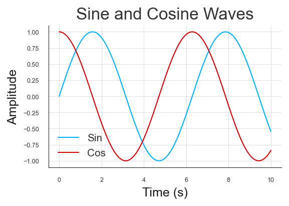
Legends
The .legend() function allows you to add a legend to the plot.
#plt.style.use('classic')
#plt.style.use('seaborn')
#plt.style.use('seaborn-paper')

x = np.linspace(0, 10, 100)
y1 = np.sin(x)
y2 = np.cos(x)

plt.plot(x, y1, x, y2)
plt.title('Sine and Cosine Waves')
plt.ylabel('Amplitude')
plt.xlabel('Time (s)')
plt.legend(['Sin', 'Cos'], fontsize=10)
plt.show()
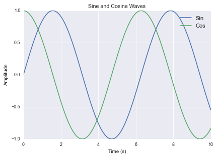
Saving Figures
We can use plt.savefig() to save the current figure. In the example below, we
style and generate a plot, then call plt.gcf() to get the current
figure, then adjust its size, and use savefig() to save the figure as a
JPEG image.
plt.style.use('classic')
plt.style.use('seaborn')
plt.style.use('seaborn-paper')

x = np.linspace(0, 10, 100)
y1 = np.sin(x)
y2 = np.cos(x)

plt.plot(x, y1, x, y2)
plt.title('Sine and Cosine Waves')
plt.ylabel('Amplitude')
plt.xlabel('Time (s)')
plt.legend(['Sin', 'Cos'], fontsize=10)


# Ge the current figure and update its size
fig = plt.gcf()
fig.set_size_inches(6, 4)

# Save the figure
plt.savefig('output.jpg', dpi=300)
plt.show()
Additional Resources
This barely scratches the surface of what can be done with Matplotlib. For more examples, check out the matplotlib example gallery.